Monday, December 19, 2011

Final Thoughts


The semester seems to have passed by in the blink of an eye. Media 150 was a great class and even though a lot of the handheld camera things were self explanatory, I really enjoyed the photoshop assignment. Hearing that the class will now be two hours long instead of one is the best thing that could have been done. The students need a little bit less lecturing before a lab and they need to try things out. Perhaps a worksheet that explains the functions and steps would be better. That way each student works at their own pace and the creativity flows. I felt a lot of pressure to finish a project no matter what, instead of investing time into it like it deserved.

The lectures were entertaining. I wish that the film students could have their own lecture. Media 150 is a prerequisite for film production one ( a requirement as a film major) and having to learn about blogging wasn't that appealing to me. Once the technical parts of filmmaking were explained I paid more attention. My main concern with the course was the issue that there was never any time. However that has been corrected and all is well.

Sunday, December 18, 2011

Lost in Translation- Extra Credit


Sofia Coppola is arguably one of the best directors out there. Her ingenuity and creativity captured my imagination at the age of fourteen when Lost In Translation came out. This film is my favorite film of all time. The poignant silence and colorful, dynamic images carry the film forward making it worthy of all the Golden Globes and Oscar nominations it received.

The film is about Charlotte, a woman in her mid-twenties who’s recently graduated from Yale. She is in Tokyo with her photographer husband who is very absorbed in his work and doesn’t have time for her. In this sense she is alone. The other main character of Lost in Translation is Bob Harris played by Bill Murray. Bob is an aging actor who is in Tokyo doing a whisky commercial instead of “doing a play somewhere.” After twenty-five years of marriage, the relationship with his wife seems to be more business, almost as if she were his assistant. Once Bob and Charlotte meet, they start spending time with one another. He provides the wisdom that comes with age and she shows Bob that one can still enjoy life no matter how old.

The opening sequence sets up the audience for a film about vulnerability and tapping into the inner minds of characters lost in foreign nation. Japan is one of the cities in the world where there is always something to do but by not knowing their place in the universe, the characters cannot enjoy their time there. This aspect of the film gives it its sadness but there’s also a romantic feel to it.

The opening sequence begins with a close up of Scarlett Johansson’s butt in lacey pink underwear. A painting Sophia Coppola liked inspired this shot. The artist John Kacere is a famous photorealist photographer who takes pictures of women’s bottoms in their underwear. This image sets up the feeling Sofia Coppola and the director of photography wanted to convey. The entire film of Lost in Translation is meant to be a snapshot of Tokyo. The first snapshot of this film is Scarlett Johansson’s bottom.


After this shot , the title sequence appears and there is a pause. After a few seconds the screen goes dark and there is a transition. All that is heard is a voiceover welcoming someone or perhaps even the audience to Tokyo. To me this transition adds to the dream quality of the film. First, the film opens with someone laying on their side on a bed. The screen goes black and an unknown voice welcomes the audience to a new land. Bill Murray is then seen sleeping in his car.

The song Girls by the band Death in Vegas picks up slowly. The harmonizing is symbolic of jet lag. It slowly gets louder and louder as Bill Murray’s character awakens. There is a close up on his face.When Bill Murray wakes up and looks around, the combination with the music makes it seems like he is waking up in a dream. The exterior shot of the car has the background blurred as though he isn’t fully conscious yet.


The rest of the soundtrack is similar to this song. Without many lyrics it moves the soul, producing a calming effect within the listener.The music "nails the hazy conscious state of actors Bill Murray" and Scarlet Johansson. It also provides a safe, warm soundtrack that coddles the listeners, almost as if saying traveling alone is not as bad as it seems. The soundtrack is made of mostly indie rocks. However the thing about the soundtrack that reflects the film in it''s entirety is the use of songs without lyrics. The film is in essence a silent film.


Once his eyes are fully open, an establishing shot if the Shibuya district appears on the screen. The neon signs and bright colors are a contrast from the complete darkness the audience was in during the transition. One goes from being welcomed to actually being in Tokyo. The Shibuya district is known as the entertainment district. The irony of this being the first place we see in Tokyo is that Bob Harris is not interested in being there. He's in a rut in his life where nothing seems to matter, he appears surprised but not amused.


The details on the buildings become point of view shots. Bill Murray’s character, Bob is looking around. Everything is obviously in Japanese and it creates a disorienting feeling, the audience is on this journey with him. The zooming in of the background is appealing to the eye. It not only establishes the location but it also sets a mood. The mood of one person visiting a large city is overwhelming.

The camera pans back and forth showing all the people walking around at night. At that moment it seems that things seem to slow down. This is the realization that this place is very different from America because of the people and the way . A McDonald’s is present in the background, a golden “m” that is recognizable throughout the entire world without any translation. The director of photography, Lance Acord, used a lightweight Aaton 35 camera to reproduce a nostalgic aesthetic similar to the snapshot, “like a memory and a love story” according to Coppola, to photograph the particular combination of traditional and western influences characteristic of contemporary Japanese culture (Coppola quoted in Mitchell).


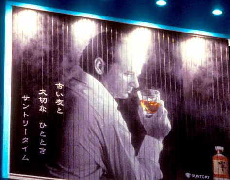
The camera zooms in when Bob sees a billboard of himself. Although the film has been silent so far, except for the voice over saying we’re in Tokyo, this shot provided exposition. If Bob can be on a billboard it means he has a certain kind of status. Sticking to the formula for narrative strategies, the first sequence of the film acts as exposition. We get a sense of the male protagonist and even though we only saw a woman’s behind, the audience knows that a female presence will be around shortly. She is confined to a room while there’s an entire city waiting to be explored.

After seeing himself on the billboard Bob rubs his eyes. These prescient sequence fragments triple Bill Murray’s image separating the “public” Bob who exploits his fading star to sell whisky for three million American dollars, the “private” Bob who aspires to “good roles” and Bill Murray whose ironic, subversive screen persona threatens to destabilize the illusion. The next shot is almost epilepsy inducing, it is a neon sign of spirals that diminish in perspective. The colors of the seen are very vibrant; it’s a contrast to how Bob feels. The lighting comes off the buildings themselves so the first few shots in the car seem documentary like.

The opening sequence ends with a master shot of Bob’s car pulling into the front of a hotel. The picture below is a close up but the shot begins with a long shot. The hotel turns out to be one of the most exclusive one’s in Tokyo. However, even these people can afford to be here they don’t seem very happy. The class difference is apparent because those hanging out in dim lit sketchy bars appear to be very happy.


The way Sofia Coppola planned out the film was by taking series of photographs throughout Tokyo. Once she had evidence of what she wanted to visually recreated, she handed the images to the cast and crew. The photos she took were used as references throughout the twenty-seven day shoot.

Sofia made Lost in Translation as a tribute to Tokyo. She worked and visited many years, often with her father Francis Ford Coppola. The background and source material for the film is rumored to be about her life. Charlotte’s husband is a photographer, and Sofia used to be married to Spike Jonze. The obnoxious character Anna Farris plays in the film is suppose to stand for Cameron Diaz, even though this has never been confirmed. A lot about the film is personal to Sofia. Her real life friend “Charlie Brown” used to show her around Tokyo while her then husband worked (Sofia is now married to Phoenix front man Thomas Mars, who’s song “Too Young” plays in the film). Sofia thought it only appropriate to have Charlie Brown in her film. He was not only her guide but then becomes the guide to the audience. Later on in the film Shibuya is visited. Karaoke Bars, Restaurants and someone’s home are visited. As Bob’s interest in Tokyo grows, the audience sees more places.

This film provides reassurance for travelers. In two weeks I will be in Tokyo and the film had such an impact on the people there, there are actual tours where one can visit the exact places from the film. Visiting a fast paced city doesn’t necessarily mean that one will be thrill seeking all the time. The film shows the audience that there is a haunting quiet beauty to a place. A place as big as Tokyo can still be lonely. Sofia shared this feeling with the world.


Monday, December 5, 2011

The Dilemma

From the inception of the project Ed and I had a vague idea as to what we wanted to make. We knew we wanted to have a video that was unique and fully captured the space within Hunter College. Hunter College has a unique layout that can sometimes be overwhelming for both students and faculty. The original idea was to have a video made from the perspective of a child walking through Hunter College. The point of origin would have been the security desk downstairs and the end would have been the second floor daycare. However we never got a call back saying we had permission to go into the daycare. With our back up becoming our new idea we had another member join the group. Having three people work on the project brought a fresh perspective to the filming. The new idea was to have a student lost within the space of Hunter and their mission was to get food from the trucks outside before his next class started. We used a digital hand held camera. The scenes we captured were a bit shaky however we all agreed that the cinematography then added an element of realism. The over the shoulder shots when Ed walks into the second floor auditorium transforms Hunter College the location, into Hunter College the antagonist. With the labyrinth that is Hunter, Ed is never able to reach his goal on time. During the editing phase we realized the original footage had the potential to take on two very different emotional styles. It could have been really comedic but the altering of the color and the addition of music make it darker and more serious. The audience feels the overwhelmed sensation the protagonist is feeling. While editing we had yet another member join the group and while editing she was able to provide insightful feedback on the timing being crucial to the vibe the video was going for. Ultimately the two types of editing we used was temporal and emphasis. We wanted to overdramatize how exhausting it can be getting around Hunter.

Wednesday, November 9, 2011

Storyboard Concepts


What happens when you think big and creative? The establishment tries to bring you down. My partner and I had the idea of doing our three minute video from the perspective of a child. They would walk through the hallways of Hunter until reaching the Children's Center on the second floor. We would zoom in on the sign that says welcome. Then we'd go down a long hallway and stop at the intercom. Inside we would film everything as if it were a child hanging up their coat in their cubby, sitting at a table, playing with their blocks, having lunch etc. However we left a message for Rittela F. Letellier, the director and we did not get a call back.

So our back up plan would be to have a guy given a ten minute break from class and he tries to find his way around Hunter in order to reach the food truck outside. he goes through the auditorium, through the hallways, he ends up on the roof. However by the time he reaches the front door he looks down at his watch and sees that it's time to go back to class.

Museum of the Moving Image

Televisions were made to resemble household appliances in order to appeal to women. How thoughtful.
The Mask was a film I was obsessed with as a child. "They call me Cuba Pete, I'm the king of the rumba beat, when I shake my maracas chick chicky boom."
The loveliest man lady I have ever seen.
Winona Ryder's legs from Black Swan.
This looked like a display from Willy Wonka and the Chocolate Factory.

It all started with a big misunderstanding aboard the spaceship. The two in command informed the rest of us we had been booked for last Friday. Things looked dismal and someone appointed themselves leader. "We should just sign in and leave."

However the time spent arguing was well spent. Once everything got sorted out one of the most informing and interesting trips took place. The Museum of Moving Image is situated in Queens because Paramount built many studios around the area, even before it was known as Paramount.

The third floor had a lot of the simulators and it was housed in an old film processing unit. The first demonstration was not only full of exciting movie trivia but I was very educational. The sound editing demonstration used James Cameron's Titanic as the basis. If each sound layer was played on its own the movie lost that emotional connection it originally had in 1997. The guide was very enthusiastic about sharing what he knew. I was extremely dumbfounded by the attention to detail James Cameron invested down to the smallest thing. Hiring Italian, Irish, and British actors to do the screams that would be looped in the sinking scene was brilliant. He really went in for the authenticity factor. The real lesson I learned was that sometimes being a minimalist and working with an aluminum can to reproduce a tower collapsing is not only creative but cost efficient.

Overall, this trip was very enjoyable. Having the actual evolution of television and film before one’s eyes is rather inspiring. One can easily learn the things online but I think the sense of community really does foster learning.

Monday, November 7, 2011

“This is a story full of lies and fabrications but truer for their inclusion.” Tim Burton’s film Big Fish was marketed as a “fairy tale for a grown up.” I believe the DVD cover is so extraordinarily beautiful the merging of the images and words give off the magical feeling felt throughout the entire film. The words are centered and frame the small man in the middle. The choice of typography has a dual function. It not only gives the films’ title but it also completes the landscape. In the film, the main character Edward Bloom was able to take a common event and turn it into something wonderful by adding details to it. The designers of the DVD cover did the same and morphed a word into a tree. The colors used are bold and mesmerizing. The landscape goes off into the distance, creating some perspective. The colors seem to blend when the land meets the sky. The viewers’ eye is transfixed because one can almost feel themselves being on the same journey the character is on. The only criticism I have of the DVD cover is the quotes put on the top & bottom. The DVD comes in a boxed set so the only way someone can see the reviews would have been by opening the package. It distracts and takes away from the magical element the image and text have. I think the simplistic approach works best on the DVD cover, so the reviews should be removed.

Video Haiku

The title of my groups' video haiku was "Traffic." A haiku is traditionally made up of three lines. The three lines go in the pattern of having 5, 7, 5 syllables. The poem I wrote based on our video was (Line 1) He swiped into school, (Line 2) People, traffic, life around (Line 3) School of the future. Hunter incorporates a modern architectural approach in the heart of the city. The glass passageway that connects the three buildings are bridges connecting the past, present, and future.

This was the first time the duo became and trio. I found it harder to work with a third person, no matter how pleasant the person is. It was too many ideas being discussed. I've yet to learn how to tell someone "no I don't like your idea." However, I think the assignment was nicely done. Each of us brought a different perspective. I would have never thought that cluttered advertisements could be considered "traffic." The word traffic can be described as the movement of vehicles and pedestrians but it can also be defined as "the message or signals transmitted through a communications system."

Monday, October 24, 2011

Stamp Project

The Peace Corps is celebrating 50 years. It was formed in 1961 and since then it has provided accessibility for those who want to help and see the world. One can become emerged in a foreign culture and discover themselves at the same time.

At first we were told that the stamp project had to be a political theme. When I think politics all I can think of are presidents for some reason. I ended up googling anniversaries being celebrated in 2011 and a link explaining the creation of the Peace Corps by President Kennedy showed up.

I wanted the stamp to be moving and visually captivating. I focused on coming up with such a brilliant idea that by the time I was inspired it was time to leave for the day. Although I do like my stamp design, I feel I wasn't bold enough to try different effects. This project could have easily been done on Microsoft Paint. I really admired my classmates who used the different effects Photoshop had and experimented. In all honesty some of the designs made no sense whatsoever but I respect that they tried something new.

In order to do justice to my Peace Corps themes, I would want to do a series of stamps each commemorating a different continent where one can go and volunteer. In those stamp designs I would try and be more bold, trying to capture a culture in a limited amount of space. Now there's a challenge.

Potato Head Assignment

This was my first real attempt with Photoshop. I used to play around with all the different options on it before but this was my first assignment. I'm kind of proud of this sad little potato head. I just hope my work evolves and shows significant improvement by the end of the semester.

At first it was very tedious creating all the layers and trying to give her "cute" locks. Once I got the hang of it, I was using the shortcuts on the keyboard to get it done. I wish I had more time to explore the other options. I do not like how her mouth came out. If I ever master Photoshop. I will use my new found power to fix her mouth. It bothers me so much.

Monday, October 17, 2011

Assignment #1 -- Pictures that represent Hunter.


My partner and I decided to focus on Hunter trash. Behold the trash from the cafeteria, hallway and library. When we were supposed to share our ideas, ours was met with enthusiasm and general praise from the class. However, I feel our execution wasn't as great as it could've been. The trash looks like trash that could be found in any other place, except for the last image, which was the one the class liked.

If I were to redo this project, I'd want to capture majestic images. For example, a pigeon flying away while carrying a piece of a bagel. Or a pigeon's next made out of candy wrappers it found on the street. I digress with all the pigeon talk but I know there is an interesting element to trash.

My favorite image is the one with the orange. I love how waste can still be so colorful.